The guest page, rethought: a search field you can't miss
Published on
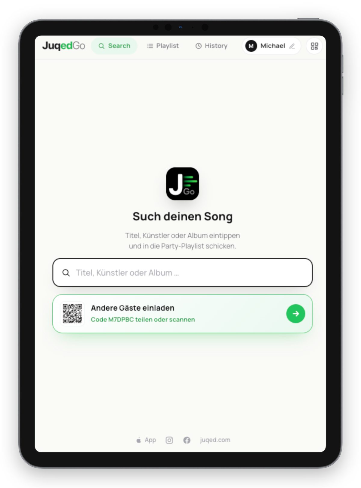
Why a jukebox app for guests has to be one thing above all: self-explanatory
As of yesterday, the Juqed Go guest page has been completely reworked – and the reason behind it was a fairly humbling lesson. I got to watch a handful of volunteer testers use the app, and especially the page where guests request their songs, for the very first time. What felt perfectly logical to me as the developer was nowhere near as obvious to someone who just wants to quickly request a track at a party.
The centered search field: impossible to miss
The most important change is also the simplest one: the search field for new songs now sits large and centered, right at the heart of the page. No hunting, no guessing, no host having to explain it. Type a song, send it, done. A good guest page should work without a single word of instruction – and that was exactly the goal behind this redesign.
It sounds trivial, but small things like this decide whether guests join in or quietly opt out. Anyone who has to figure out where to type will often request nothing at all. Anyone who spots the field instantly just starts typing.
How Juqed Go works
In case you don't know Juqed Go yet: it's a jukebox for your event. Your guests request the music straight from the browser on their smartphone – no app installation, no shared Wi-Fi. That way the mood of the room decides what plays next, and you as the host can focus on your guests instead of the playlist.
Whether it's a relaxed evening with friends, a birthday, a wedding, or the bar around the corner: a single one-time app purchase already gives you everything you need for a great night. And now that the guest page is this clear, nothing stands between your guests and their first song request.
